Angular Material 选择框2025年3月17日 | 阅读 7 分钟 <mat-select> 是一个表单控件,用于从一组选项中选择一个值。 它与原始的 <select> 元素相同。 我们将在 Material Design Imagination 中讨论更多关于选择的内容。 要添加选择选项,请将 <mat-select> 元素添加到 <mat-select>。 Angular 内容支持在原生 <select> 元素中使用 <mat-form-field>。 将 matNativeControl 属性添加到 <select> 元素以在 <mat-form-field> 内部使用父选择。 app.component.html app.component.ts 输出  获取和设置选择值<mat-select> 支持对 value 属性的双向绑定,无需 Angular 表单。 app.component.html app.component.ts 输出  <mat-select> 和 <select> 都支持 Formsmodule (NgModel) 和 ReactiveFormsModule (FormControl, FormGroup, etc.)。 app.component.html app.component.ts 输出  表单字段特性许多 <mat-form-field> 特性与 <select> 和 <mat-select> 一起使用。 它包括错误消息、前缀、提示文本和后缀。 app.component.html app.component.ts 输出  设置静态占位符当 <mat-form-field> 标签浮动或 <mat-select> 标签为空时,将显示占位符。 它用于向用户提供关于他们选择的值的额外指示。 占位符通过在 <mat-select> 元素上设置 placeholder 属性来指定。 在某些情况下,<mat-form-field> 使用占位符作为标签。 禁用选择或单个选项我们可以通过使用 <select> 或 <mat-select> 和 <option> 或 <mat-option> 元素上的 Disable 属性来禁用选择中的整个选择或单个选项。 app.component.html app.component.ts 输出 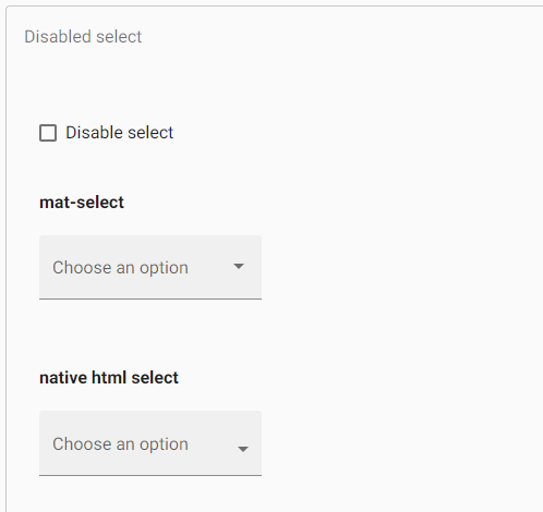 创建选项组<mat-optgroup> 元素用于将公共选项分组在子标题下。 组名称将使用 <mat-optgroup> 的 label 属性设置。 与单个 <mat-options> 元素一样,整个 <mat-Optgroup> 可以通过设置 Disable 属性来禁用或启用。 app.component.html app.component.ts 输出  多重选择<mat-select> 默认为单选模式,但可以通过设置其他属性来配置为允许不同的类。 在多选模式下使用 <mat-select> 时,其值将是所有选定值的排序列表,而不是单个值。 app.component.html app.component.ts 输出  自定义触发器标签如果必须在 <mat-select> 中显示自定义触发器标签,则可以使用 <mat-select-trigger> 元素。 禁用涟漪效果当用户单击 <mat-option> 时,将显示涟漪动画。 可以通过 <mat-select> 上的 disableRipple 属性禁用它。 app.component.html app.component.ts 输出  向下拉面板添加自定义样式要设置下拉面板的样式, app.component.html app.component.ts app.component.css 输出  更改何时显示错误消息<mat-form-field> 允许我们将错误消息与 <select> 或 <mat-select> 相关联。 默认情况下,当控件无效或用户与元素交互时,会出现错误消息。 如果我们想覆盖该行为,我们可以使用 errorStateMatcher 属性 <mat-select>。 该属性采用 ErrorStateMatcher 对象的实例 app.component.html app.component.ts 输出  可以通过设置 ErrorStateMatcher 提供程序来指定全局错误条件匹配。 它适用于所有输入。 ShowOnDirtyErrorStateMatcher 可用于在输入无效时显示全局可用的输入错误。 键盘交互DOWN_ARROW: 它将焦点放在下一个选项上 UP_ARROW: 它将焦点放在上一个选项上 ENTER 或 SPACE: 它选择焦点项目 可访问性<mat-select> 组件具有“combobox”,下拉面板具有“listbox”,选择面板中的选项具有“option”。 原生 <select> 提供最佳的可访问性,并且屏幕阅读器支持它。 故障排除Error: 初始化后无法更改选择的多个模式 如果我们尝试将动态值的不同属性绑定到 <mat-select>,则会发生此错误。 Error: 值是多选模式下的数组 当我们为 <mat-select multiple> 分配除 null、undefined 或数组之外的值时,会发生此错误。 例如, mySelect.value = 'option1'。 |
我们请求您订阅我们的新闻通讯以获取最新更新。
我们提供所有技术(如 Java 教程、Android、Java 框架)的教程和面试问题
G-13, 2nd Floor, Sec-3, Noida, UP, 201301, India

 Python
 Java
Java JavaScript
 SQL
SQL C
C C++
C++ HTML
HTML CSS
CSS React
React Node.js
 Spring Boot
 C#
C# PHP
PHP MySQL
MySQL MongoDB
 AI
AI ML
ML DSA
DSA DBMS
DBMS OS
OS Aptitude
 Reasoning